
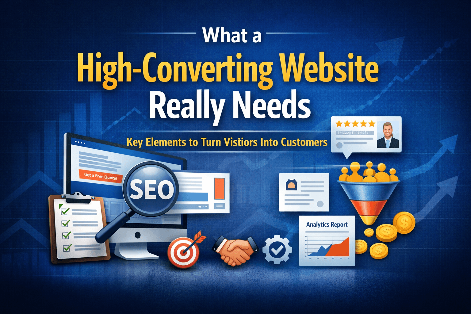
What a High-Converting Website Really Needs
(And Why Most Business Websites Fail to Deliver Leads)
A website is no longer just a digital brochure.
For a business, it should function as a 24/7 sales and lead-generation system.
Yet most small business websites fail at their core purpose—not because they look bad, but because they are not built to convert visitors into inquiries.
This article breaks down what a high-converting website truly needs, beyond design trends and visual appeal.
1. Clear Value Proposition Above the Fold
When someone lands on your website, they should immediately understand:
- What you do
- Who it is for
- How it benefits them
This must be visible without scrolling.
High-converting websites answer one question instantly:
“Why should I choose you instead of anyone else?”
What Works
- A clear headline focused on outcomes, not services
- A supporting subheadline that explains how you deliver results
- One primary call-to-action (CTA)
Example:
We Help Small Businesses Generate More Leads Through High-Converting Websites & SEO
2. Conversion-Focused Design (Not Just “Good Looking”)
Design should guide users toward action—not distract them.
A high-converting website prioritizes:
- Readability
- Visual hierarchy
- User flow
Key Design Principles
- One primary CTA per section
- Proper spacing and contrast
- Mobile-first layouts
- Fast loading speed
A beautiful website that doesn’t convert is not an asset—it’s a liability.
3. Strong Trust Signals
Visitors are naturally skeptical.
They want proof before they engage.
High-converting websites reduce hesitation using trust elements such as:
- Client logos or testimonials
- Case studies or results
- Clear service explanations
- Professional branding consistency
Even a simple statement like “Trusted by growing businesses” combined with real examples can significantly improve conversions.
4. Clear, Action-Oriented CTAs
Every page should guide the visitor toward one clear next step.
Weak CTA examples:
- “Submit”
- “Learn More”
High-converting CTA examples:
- “Get a Free Growth Audit”
- “Book a Free Consultation”
- “Request a Quote”
CTAs should be:
- Visible
- Benefit-driven
- Easy to act on
5. Messaging That Speaks to Pain Points
Your website should sound like it understands the visitor’s problems.
Instead of talking only about features, address:
- Low inquiries
- Poor Google visibility
- Wasted ad spend
- Inconsistent branding
When visitors feel understood, they are more likely to trust—and convert.
6. SEO-Ready Structure
A high-converting website is also discoverable.
SEO is not optional. It ensures:
- The right people find you
- Traffic matches buyer intent
- Long-term lead generation without ads
Essential SEO foundations include:
- Proper heading structure (H1–H3)
- Optimized page speed
- Keyword-aligned content
- Internal linking
Conversion and SEO must work together—not separately.
7. Simple, Friction-Free Forms
If your contact form is complicated, conversions will drop.
Best practices:
- Ask only essential information
- Keep forms short
- Explain what happens after submission
- Reassure users about privacy
Example:
No spam. No sales pressure. Just actionable insights.
Final Thoughts
A high-converting website is not about flashy animations or trendy layouts.
It is about clarity, trust, structure, and strategy.
When done right, your website becomes:
- Your best salesperson
- Your strongest credibility asset
- A consistent source of inbound leads
Want to Know If Your Website Converts?
At Bandaru Visuals, we help small and medium businesses turn underperforming websites into lead-generating assets.
👉 Get a Free Website & SEO Growth Audit
We’ll show you exactly what’s working, what’s not, and how to improve it.